HathiTrust Prototyping and A/B Testing
Back to ProjectsClient
HathiTrust Digital Library
Problem
The HathiTrust e-reader interface allowed for only PDF downloads, but HathiTrust staff needed to offer additional formats to respond to user requests (EPUB, plain text, and multiple image formats). The challenge was to integrate a download module with many download formats and options into an already busy e-reader interface.
Role
Design jam facilitator, prototype designer, UX researcher
Methods
Design jam, lightweight personas, story mapping, question-option-criteria design synthesis, wireframing, high fidelity prototyping, A/B quantitative and qualitative virtual unmoderated testing
Tools
Miro, Zoom, Figma, Maze, R
Deliverables
Two high fidelity prototypes in Figma, report on the results of A/B testing with recommendations
Users
Students, staff, teaching faculty, librarians, and other affiliates of HathiTrust member institutions
Process
1. Virtual collaborative design jam
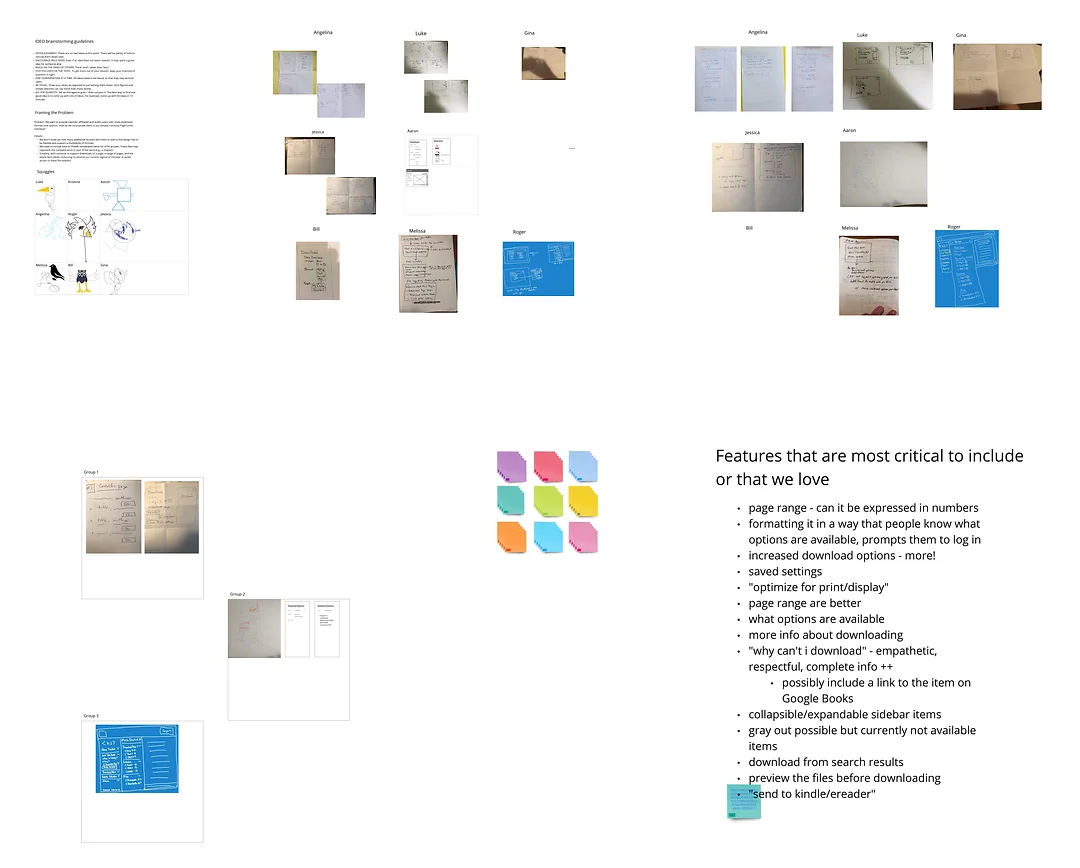
To draw on the collective knowledge and perspectives of HathiTrust staff, many of whom are not generally involved in the design and development of the website, we started with a two hour collaborative design jam session over Zoom and Miro. I co-facilitated this session and developed the following agenda:
- Introduction and ice breakers
- 6-8-5 sketches – Two rounds of individual sketching for 5 minutes with sharing in between.
- Collaborative designs – Breakout groups of 2-3 people. Each group sketches one collaborative design that draws together the positive attributes of each member’s sketches.
- Sharing and feedback – Each group shares their designs and other participants add comments and questions.
- Who-What-When matrix – Conclude by determining and assigning next steps.
2. Wireframing and design synthesis
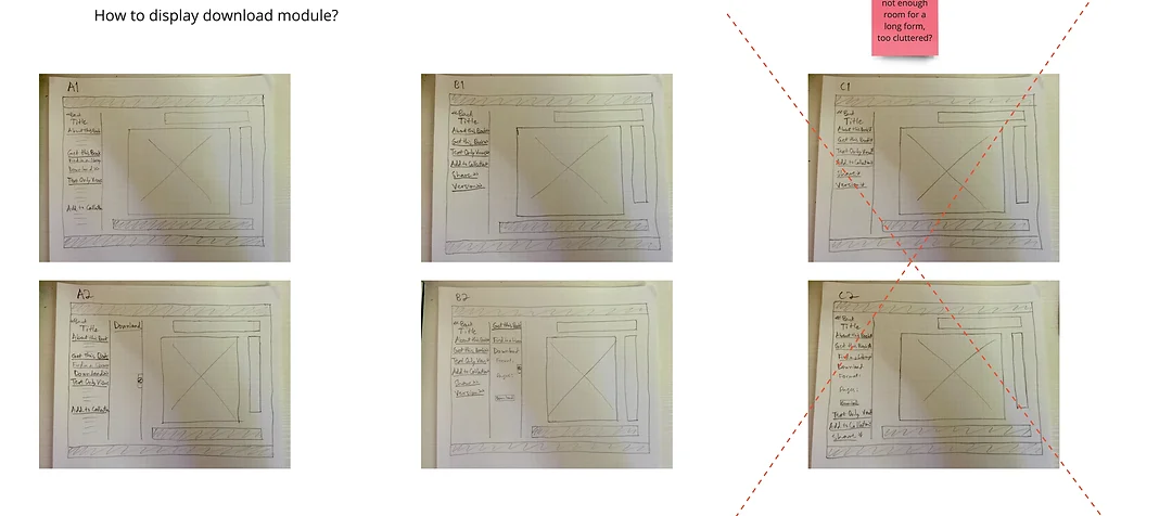
We used the Question-Option-Criteria method to choose between the design alternatives that were proposed in the design jam. This method allowed us to consider each design decision separately and prioritize the options according to the criteria that would be most important to our users. To guide this decision making, we developed four lightweight personas with a story map for each. I also sketched out a paper wireframe for each design alternative to allow us to visualize each option. The outcome of this process was two potential designs that we wanted to test out with users.
3. High fidelity prototyping
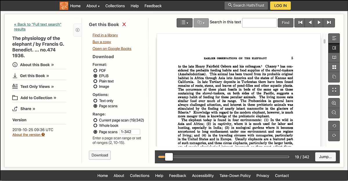
After we were happy with the wireframe sketches of the new designs, I built high fidelity interactive prototype versions of these designs in Figma. Figma was chosen because of its integration with the Maze remote user testing platform, collaborative team accounts, and free education license plan. These prototypes allowed us to test the two designs with users without devoting significant development time to coding the designs in HTML.
4. A/B Prototype Testing
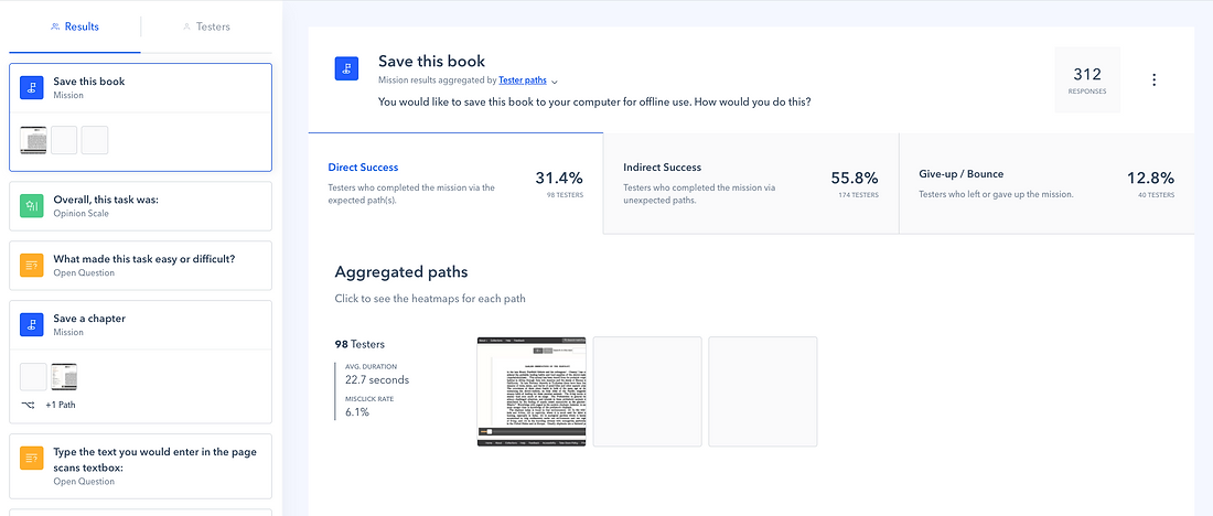
Once the prototypes were complete, I created two unmoderated usability tests (one for each prototype) in Maze. The goals of these tests were to determine which design is preferred by users and is easiest to use and gain feedback to iterate and improve on the best design. While the tests focused on collecting quantitative data (task completion rates, completion times, single ease question (SEQ) and system usability (SUS) scales) to compare the performance of the two prototypes, I also added open-ended questions to supplement the analysis with a qualitative understanding of users’ experiences and frustrations.
The two tests were almost identical to allow for a comparison between the prototypes; the only difference was the addition of a question about the usefulness of the icons for the test of the prototype that included the use of new icons in the sidebar. To ensure that the test participants were representative of the HathiTrust user base, participants were recruited through an intercept survey on the HathiTrust website. A total of 478 participants were recruited.
Research questions:
- Which design results in better usability and user satisfaction?
- How quickly and accurately can users figure out how to use the new interface designs (get to the download module, download a book)? Which design leads to faster speeds and greater success rates?
- How understandable are the language and icons that we are using?
- How useful do users find the options? Do the new interface designs provide all the options that users expect and need?
- What pain points do users experience with the existing designs?
- What additional steps do we need to take to better understand and resolve the issues (refining designs, qualitative testing)?
Tasks:
- Download the whole book
- Download a chapter of the book
Questions:
- Assessing understanding of less frequently used formats and options
- Usefulness and comprehensiveness of available formats
- Usefulness of the icons
- Single ease question and open-ended question for each task
- The system usability scale
- A final open-ended question
- Demographic information
5. Quantitative and qualitative data analysis
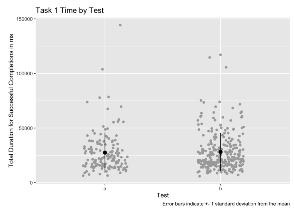
I used two sample t-tests, scatter box plots, and bar charts to compare the quantitative data between the two tests in R. Alongside the quantitative analysis, I also analyzed heatmaps and identified patterns in the qualitative responses to the open-ended questions.
Results & Next Steps
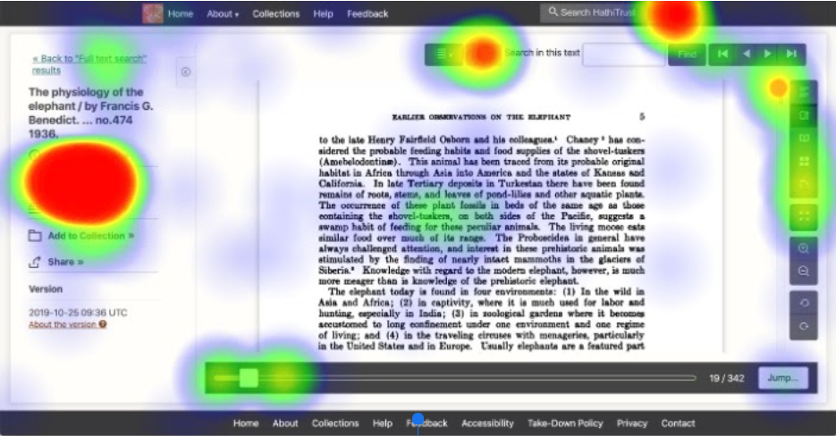
The tests revealed that there were very few and minor statistically significant differences between task performance and scale ratings of the two prototypes. We therefore chose the collapsed sidebar design as it better addressed users’ concerns about overcrowding of the interface. However, the qualitative responses in both tests revealed frustrations and usability issues that went beyond the download module. It was clear that a more comprehensive redesign that expanded and took advantage of the sidebar changes we were making was necessary. Rather than develop and deploy the selected design as is, we decided to make additional design changes, deploy those changes in a beta site, and use HotJar heatmaps, recordings, and surveys to compare the usability of the old and new versions of the site.
Lessons Learned
- In early design ideation stages, drawing on collaboration and collective wisdom of many stakeholders who aren’t usually involved in design and development can generate innovative and unexpected ideas.
- Adding qualitative questions to a quantitative usability test is very useful, though much more time consuming. When analyzing qualitative responses, be open to unanticipated insights and prepared to expand the scope if necessary.
- High fidelity prototypes should be as close to the final product as possible – small details, such as the log in status of the user, matter and can introduce confusion.